
“Dashboards” are web pages that display information and data around certain things. This recent pandemic, the Covid-19 Pandemic of 2020, resulted in the publishing of several dashboards revealing the spread of infection and impact on victims, statistically.
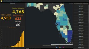 We are lucky in the State of Florida that our State Department of Health publishes granular data and has a degree of precision in reporting that other states in the USA seem to lack at the moment. This allows us to have a unique dashboard view that’s segmented county by county for Florida. The data that it’s populated with is also sourced directly from the State of Florida Department of Health. Unlike other states, our state, beautiful Florida, also reveals a lot about the spread of H1N1 over an already busy and quite deadly flu season on a weekly basis. Whoever was responsible, on a State level, for making sure that data is published for we, the residents of the State of Florida, deserves much of our gratitude; they kept the Florida Sunshine shining strong.
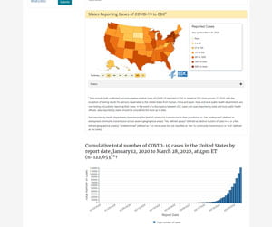 Nationally, we have the CDC’s “At a Glance” page populated by data sourced from the CDC and from state level public health laboratories like our own State Department of Health. This dashboard like page is updated almost every other day and checked daily for accuracy.
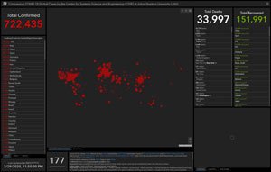 Globally we’ve got the John’s Hopkins dashboard, a view that was created ahead of time to help model pandemic spread during recent exercises like CLADE-X and Event 201. This dashboard combines data reported by individual nations around the world with little ability for US experts to verify the credibility and accuracy of. The John’s Hopkins data includes both tests and untested “presumed positive” cases.
 Additionally, on a global level there’s the WorldOMeters.info Coronavirus Data view. This site includes data from all over the world and lets users drill down, country by country, and see independent sources of data the John’s Hopkins data lacks. This site also shows trends, helpful in visualizing how much the infection rate spreads and number of active cases changes. This site also displays interesting global statistics separate from coronavirus numbers, for example the number of people being born and dying overall. It puts things in perspective.
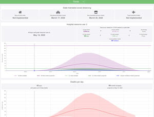 The most recent one discovered by this author is HealthData.org’s Covid Projection site. Here you’ll see where the data driving future decisions is being drawn from. You’ll be able to recognize Florida’s readiness due to DeSantis’ response versus New York’s lack of readiness and response under Cuomo. Florida won’t have a problem like New York will.
Are there other dashboard views you’ve found helpful for understanding what’s happening with Covid-19, locally or globally? Please feel free to share links to them or descriptions of them in the comments below.
Check out all the most recent headlines, local and beyond, every day on 4boca.com’s homepage. Pay attention to which Boca Raton businesses are open now and re-opening while we recover from the spread of coronavirus.


Today it looks like the number of deaths in FL has either stopped or isn’t being update/reported.
Check out this projection spreadsheet I was putting some of these numbers into, trying to look forward a bit.
https://docs.google.com/spreadsheets/u/1/d/1pErSrZY1dNUpcsc26kRpJNi58JGqIDI3nayuMJ74FK0/htmlview
This shows how Covid-19 may have to compete against H1N1 for vulnerable victims.
There’s also this
“Deaths and Hospitalizations Dashboard”
https://www.covid19florida.info/?page_id=114&fbclid=IwAR2aCjViIYQvcR_I8f_6jRDil7WxY65WEuTEAhqsgElmoKxoNQFPzU5rXuQ